Covid 19 - beyond the exponential
Plots produced with plotly in google colab. View the source code and data here on my GitHub
A disappointment
I didn’t really want to talk about Corona Virus. Not because it’s a particularly depressing topic to me, but because it’s what everyone is talking about and epidemiology is not really a subject that interests me (yet?). It’s also all the same: discussion about flattening the curve. But yesterday when my friends were telling me about all the days’ news articles and how many new cases are in <insert country here> and their current state, it really started to irk me the way the media was informing them and the rest of the world with just raw number growth. The entire corona virus media coverage seems to emphasize its exponential growth (more particularly, its growth over time). But any transmittable disease is bound to behave this way. Displaying the exponential plot and alarming the public with the ever changing number of cases serves little more than to instill fear and leaves little insight as to which countries are doing well and what their trajectories are looking like. At the time of writing, the United States is leading in the total number of confirmed cases (another issue I’ll be discussing at the bottom of this post), but the truth is, any sizeable country could be in this position and will likely reach this same level. And now at this time of writing with just over a million confirmed cases, I hope with this post I can reframe the data in a more enlightening way.
The problem with exponentials and time-based plots
Viruses among any other transmittable diseases depend on one thing: available hosts. The speed at which they spread (growth rate) depends on uncontrollable factors inherent in the disease and controllable factors such as interpersonal interactions between hosts. Exponential time plots are great for determining factors like the disease growth rate (especially when using the SIR model of infection whose differential equations have exponential time-based solutions).
But this has little value in demonstrating trends in the eye of the general public.
Case Study 1 – exponentials
Exponentials grow very fast and as such can hide trends. To our terribly feeble minds, two exponential plots laid on top of one another can tell a very different picture than of the same plots on a logarithmic scale. Take a look at this comparison of Italy and the U.S. from the New York times 10 days ago (click image to follow to article link):
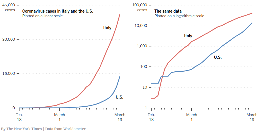
On the left, it appears that Italy is in a much worse condition than the U.S. ; it’s values are much higher. But what may not be so obvious from the plot on the left but is much better shown on the right is that the US curve is getting steeper, faster. Taking a look at the logarithmic plot on the right, it is much easier to extrapolate the future of these two countries if the trends continue (which they most definitely have. The United States total infected and rate has rapidly exceeded that of Italy).
Case Study 2 – time plots
Let’s consider South Korea. South Korea is one country that took to immediate adoption of the quarantine suggestion.
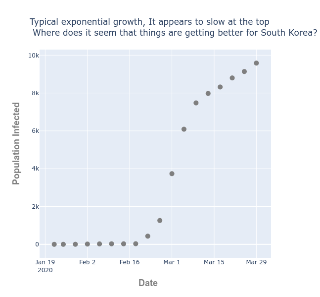
Looking at this plot of infections over time, when does it appear South Korea is recovering? It’s clear that near the top (mid March) the country is doing better and spread has slowed, but I would expect this to be reported with the jarring headline:
“South Korea infected population more than doubles in March”
Which is certainly true; from the beginning of March to the end, the total infected grows from about 4,000 to 10,000. But when the change in the number infected is plotted against the confirmed cases. It’s much more apparent that South Korea has “escaped” the exponential growth. In fact, it’s precisely at the beginning of March when South Korea changes for the better.
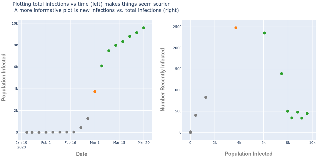
I’ve highlighted where this change occurs in orange. Infection rate after this time rapidly declines and many of the points shown in green on the right-most graph indicate the newly infected cases at this time are as low as they were in early February.
A better look at the data
Lets combine these two ideas:
- Don’t plot against time
- Plot on a logarithmic scale to reduce extreme values
This produces a much clearer picture to the general viewer about which countries are doing well and what to expect
(This plot is updated every Wednesday; due to the volume of data and the free tier of plotly api [I’m…frugal with my money] change now represents the past 2 weeks)
South Korea and China are clearly doing very well as they have escaped the main diagonal which is the road towards exponential growth. In the plot I’ve changed the size of each bubble to represent the deaths per capita, which has taken its largest toll on Europe (red. The color coding reflects each region).
This plot makes it clear that small European countries like San Marino and Andorra are being hit hard. Though this is not making big headlines because their death tolls are in the hundreds, this is in fact a very large fraction of their population. But any country, regardless of their numbers infected or killed, that remain on this diagonal are still in trouble.
The bottom line takeaways:
- Countries which fall below the line are doing ok
- Countries on the diagonal especially with larger bubbles are in trouble
This isn’t the place to delve into just why some countries bubbles are larger. It may speak to their policies, their preparedness with necessary medical equipment, their median age or many other factors. But I’ll leave that for someone else’s blog.
The problem with any data interpretation
It’s important to note that in the South Korea example, any country, regardless of their quarantine effort will eventually have a similar looking “new infections vs total infections” plot (the right-most, n-shaped plot). This is because at some point, the virus will increasingly find it difficult to acquire new hosts. But only successful countries (I define successful to mean smaller fraction of the population inflicted) will have their newly infected (y) values drop to or near zero much sooner than before the total confirmed cases (x) approaches the country’s population.
Finally with this or any other view of the data, there’s an inherent bias toward rapid growth. As time passes, the number of people being tested is increasing, due to both the increased availability of test kits and the desire for more people to want to see if they have contracted the virus. It’s much like the heart disease epidemic of the 1960’s once the label of heart disease came into the picture, the increase in cases is due in part to the availability of that diagnosis. Before the diagnosis label existed someone may have been logged as dying of “mysterious causes”.